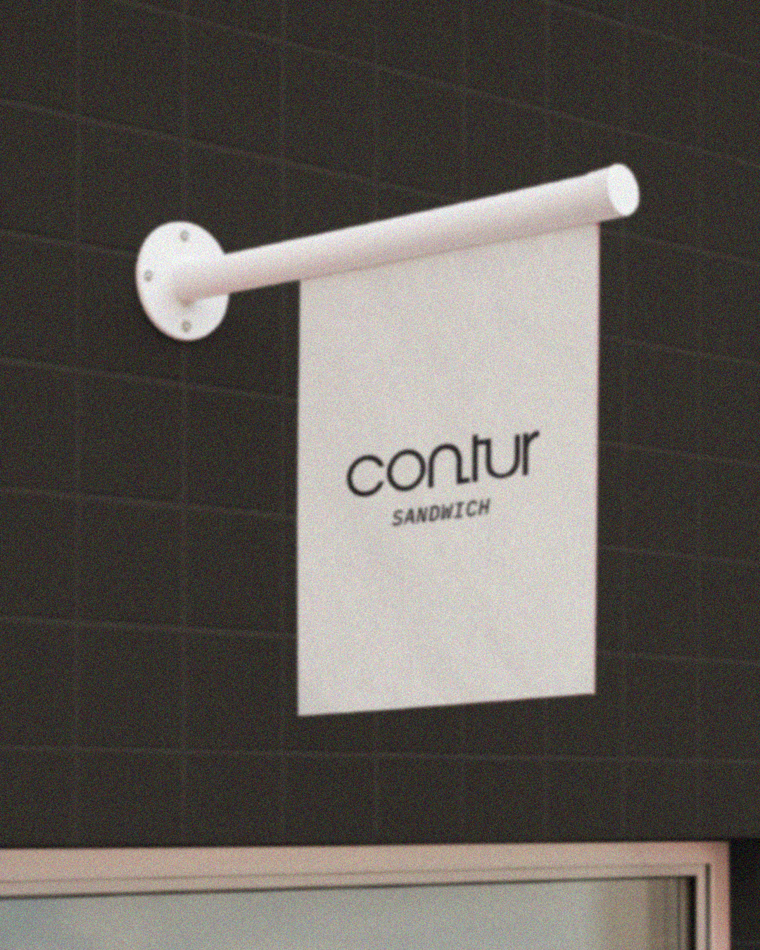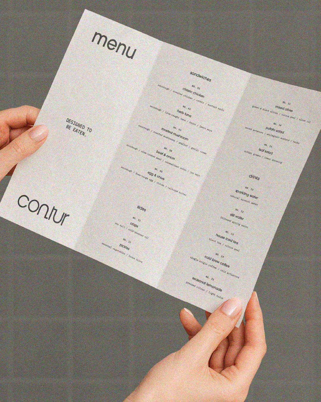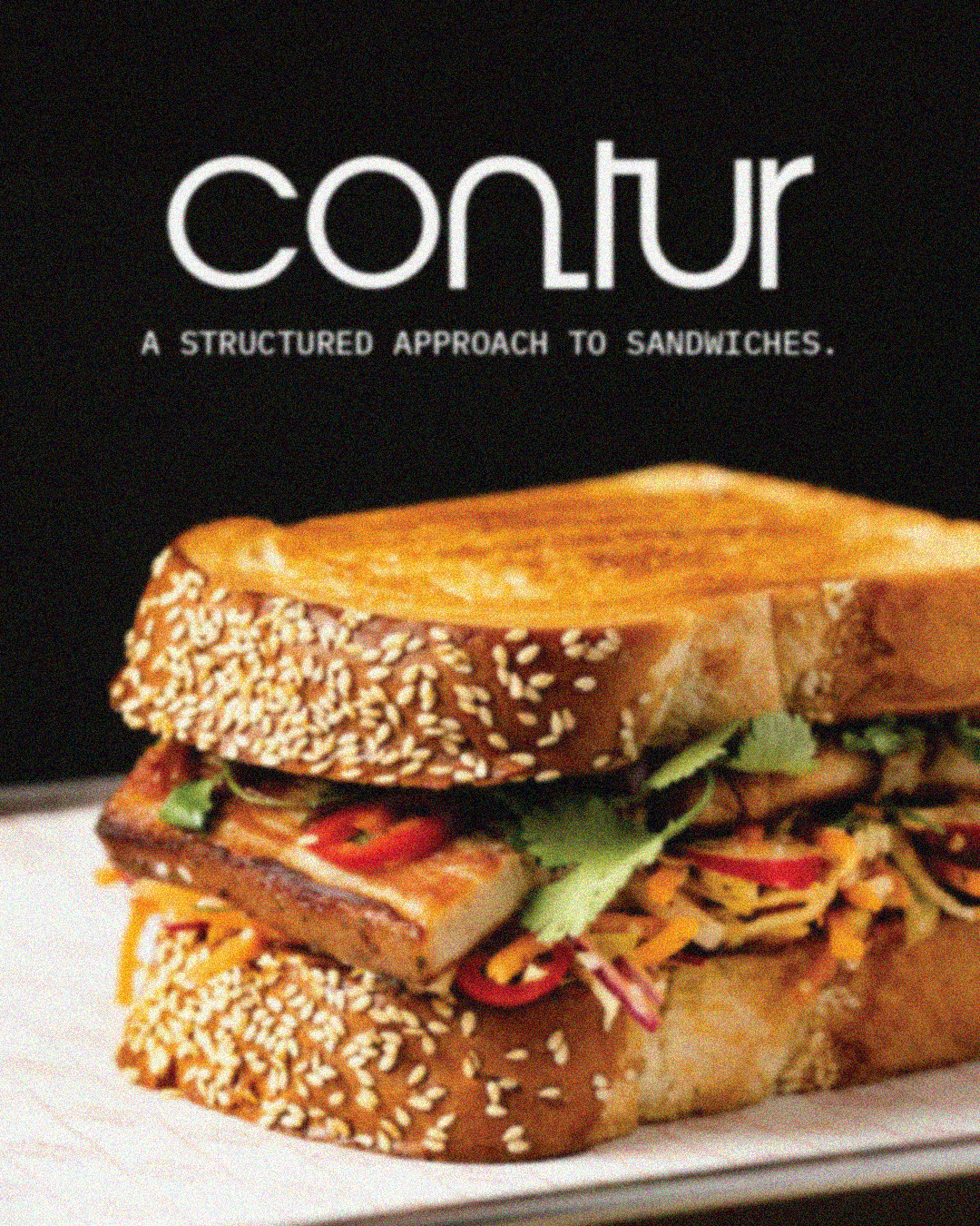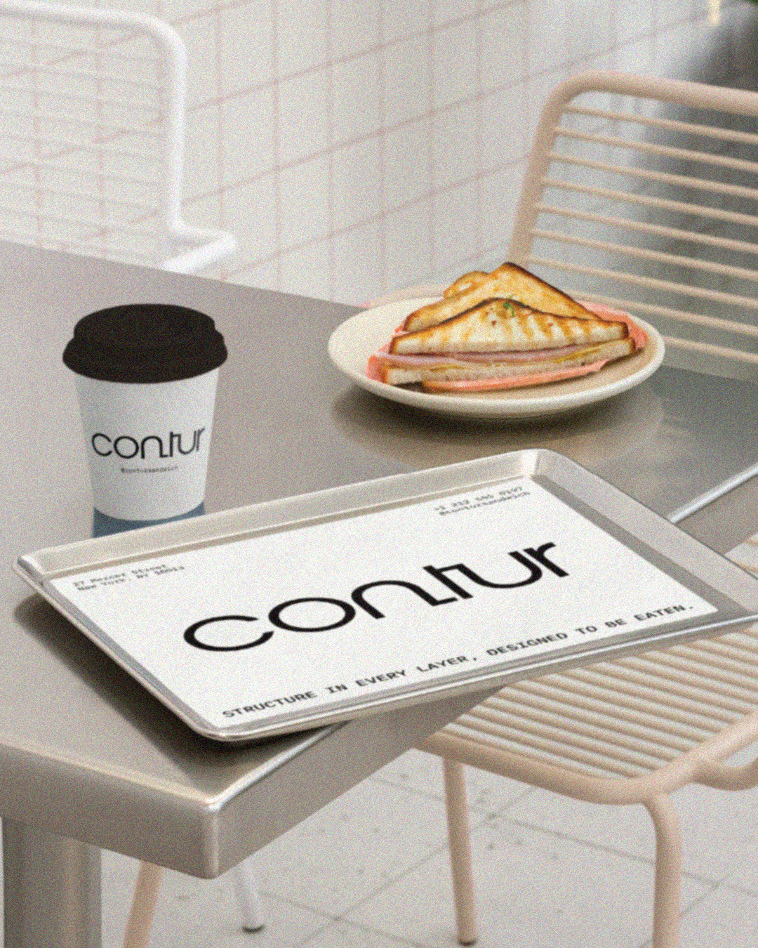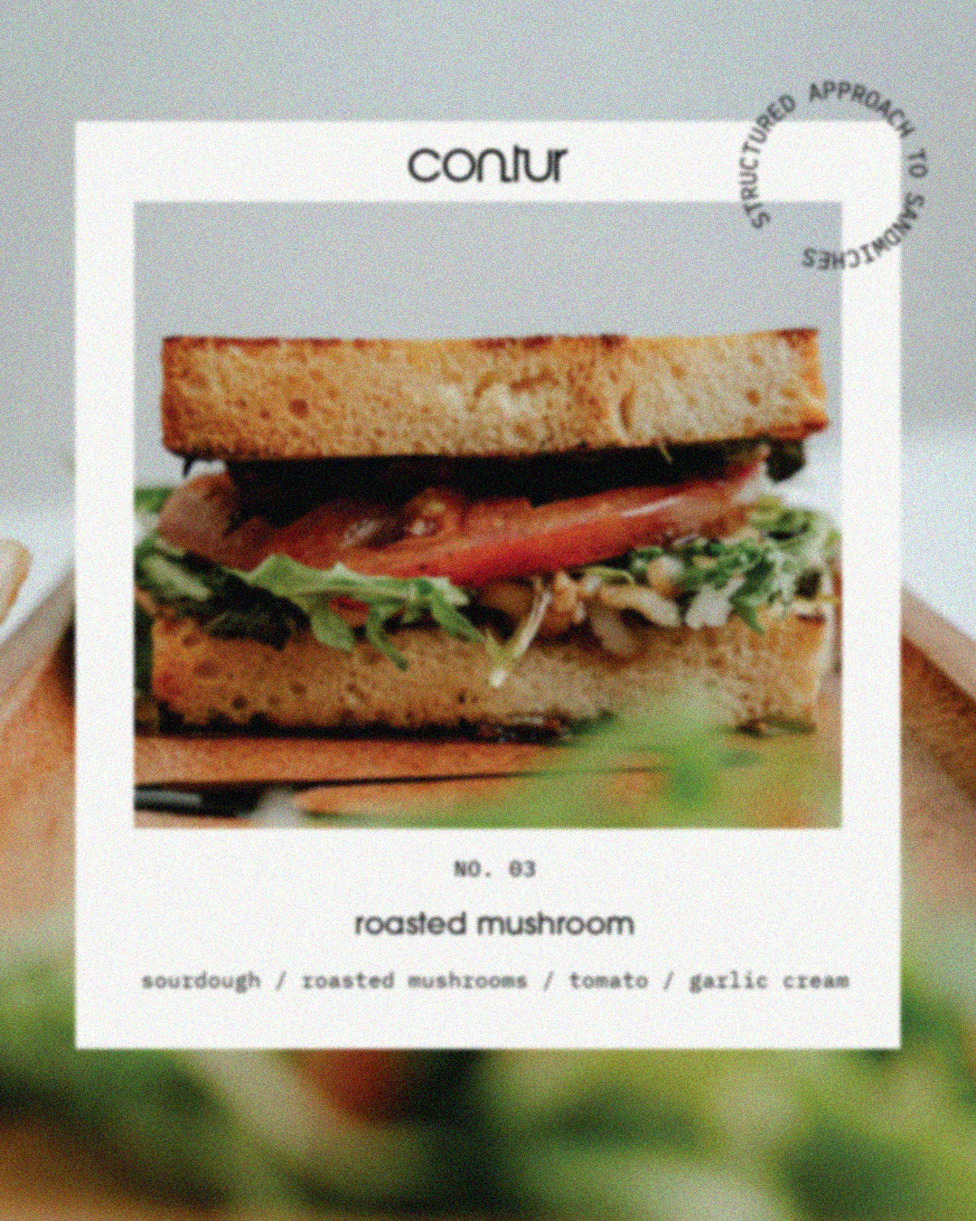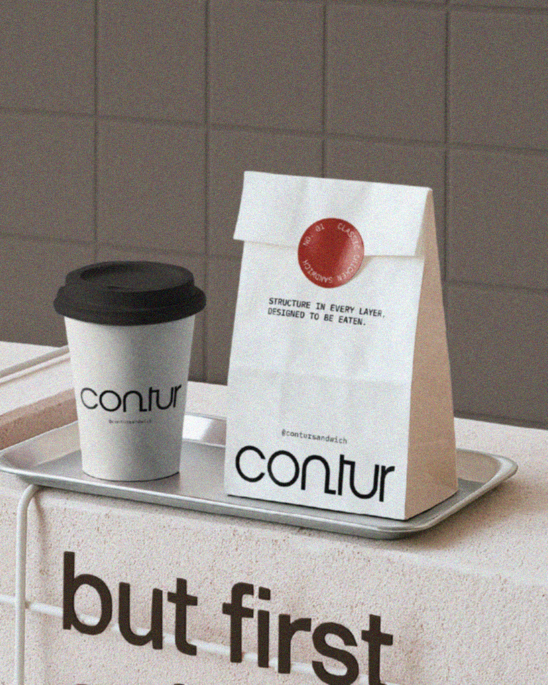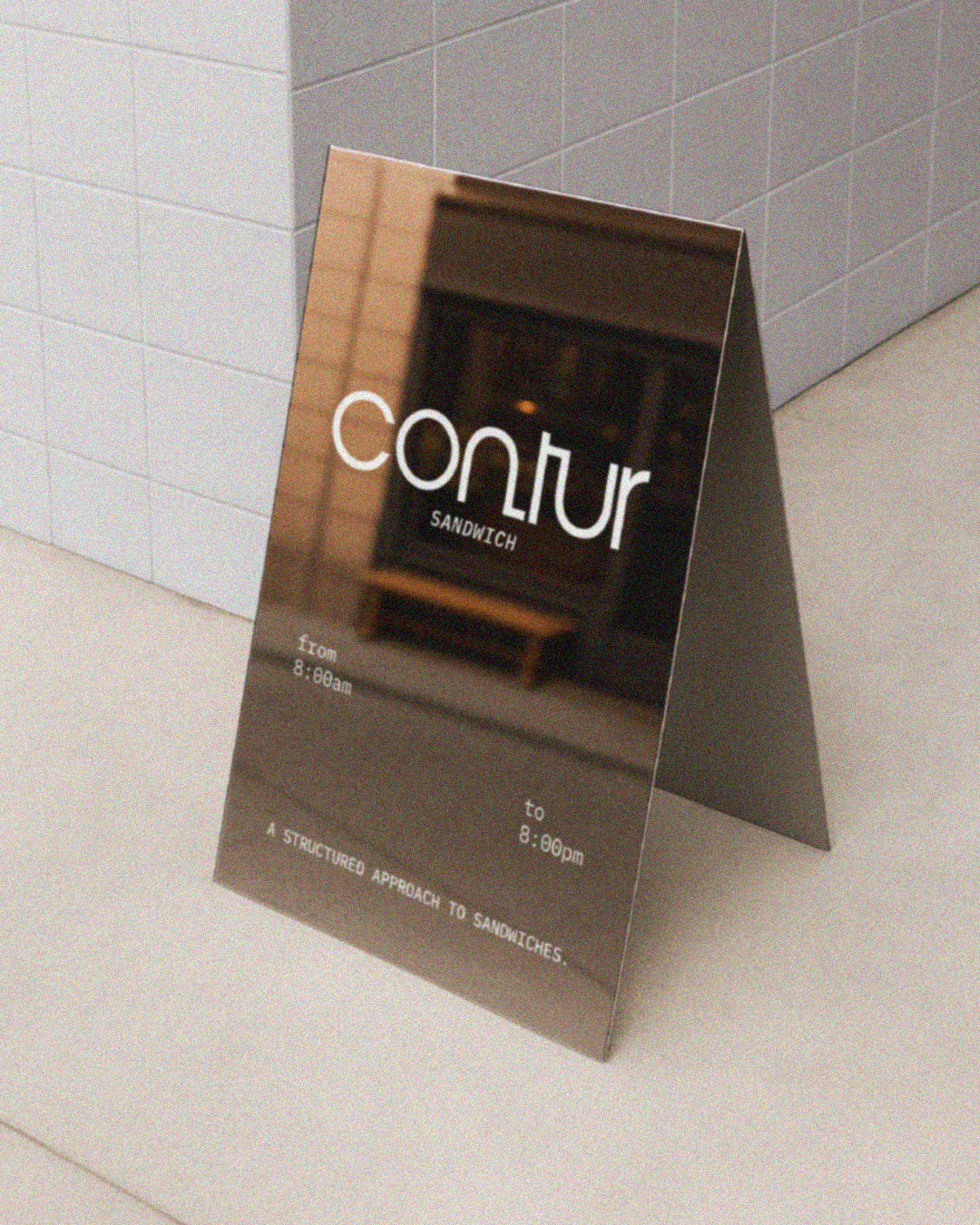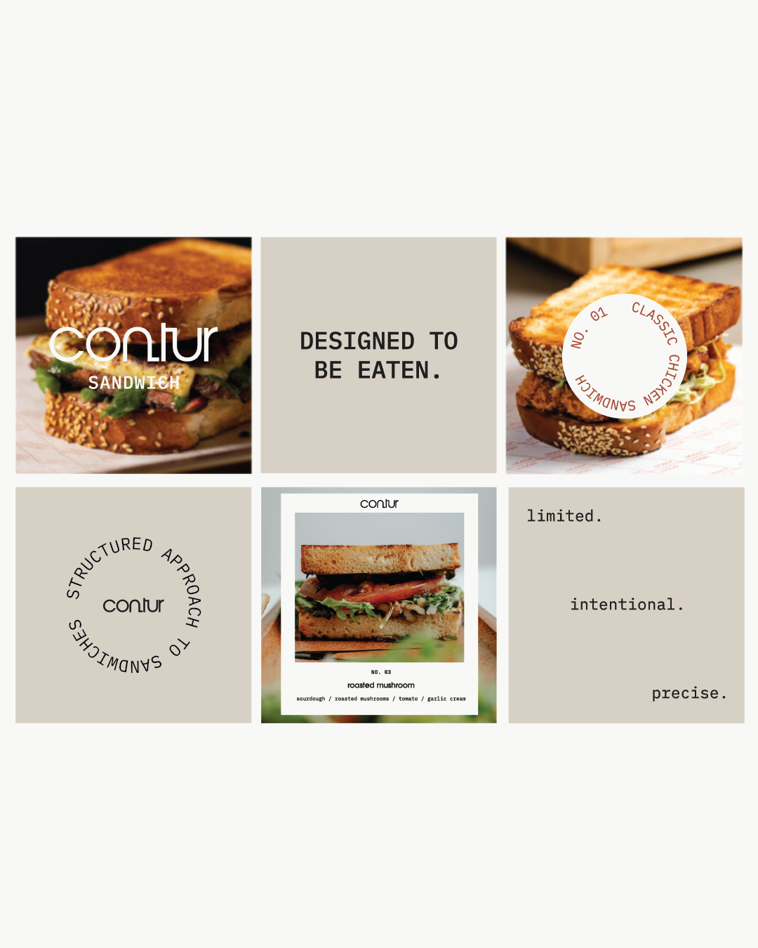
contur
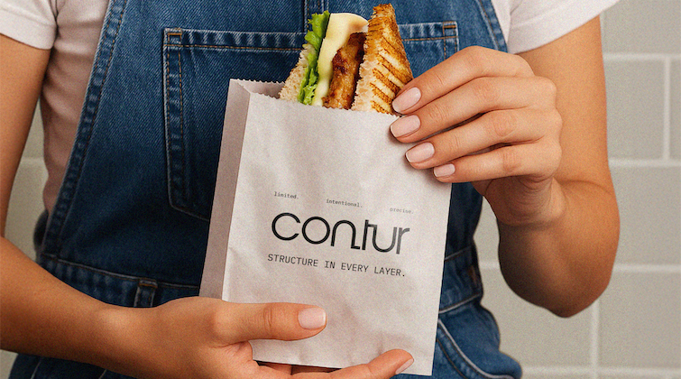
A VISUAL IDENTITY DESIGNED FOR CONTUR, A CONTEMPORARY SANDWICH SHOP THAT APPROACHES FOOD LIKE DESIGN. BUILT ON STRUCTURE, BALANCE, AND THOUGHTFUL COMPOSITION, THE BRAND REFRAMES EVERYDAY SANDWICHES AS CAREFULLY CRAFTED EXPERIENCES.
THE IDENTITY WAS DESIGNED WITH A MINIMAL AND REFINED APPROACH, USING CLEAN TYPOGRAPHY AND A RESTRAINED LOGO SYSTEM TO REFLECT PRECISION AND CLARITY. A NEUTRAL, MONOCHROME COLOUR PALETTE KEEPS THE BRAND QUIET AND FOCUSED, ALLOWING THE FOOD TO TAKE CENTRE STAGE.
THE RESULT IS A MODERN AND STRUCTURED BRAND IDENTITY THAT FEELS CONSIDERED, CONFIDENT, AND VISUALLY DRIVEN, WHERE QUALITY INGREDIENTS AND CLEAN PRESENTATION SPEAK FOR THEMSELVES.