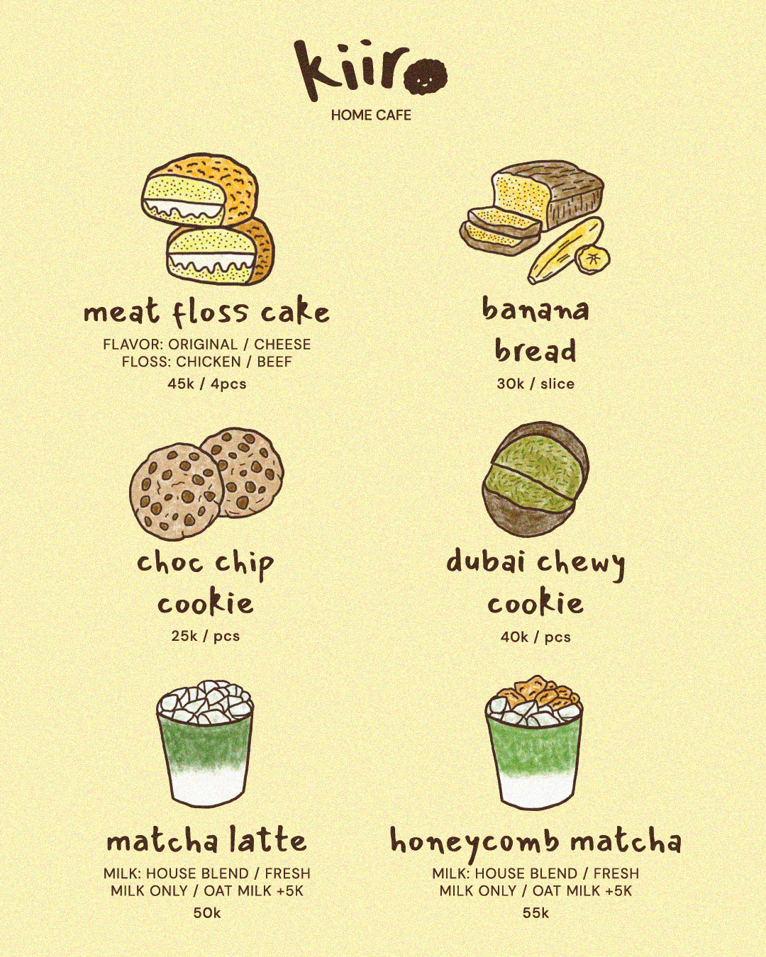
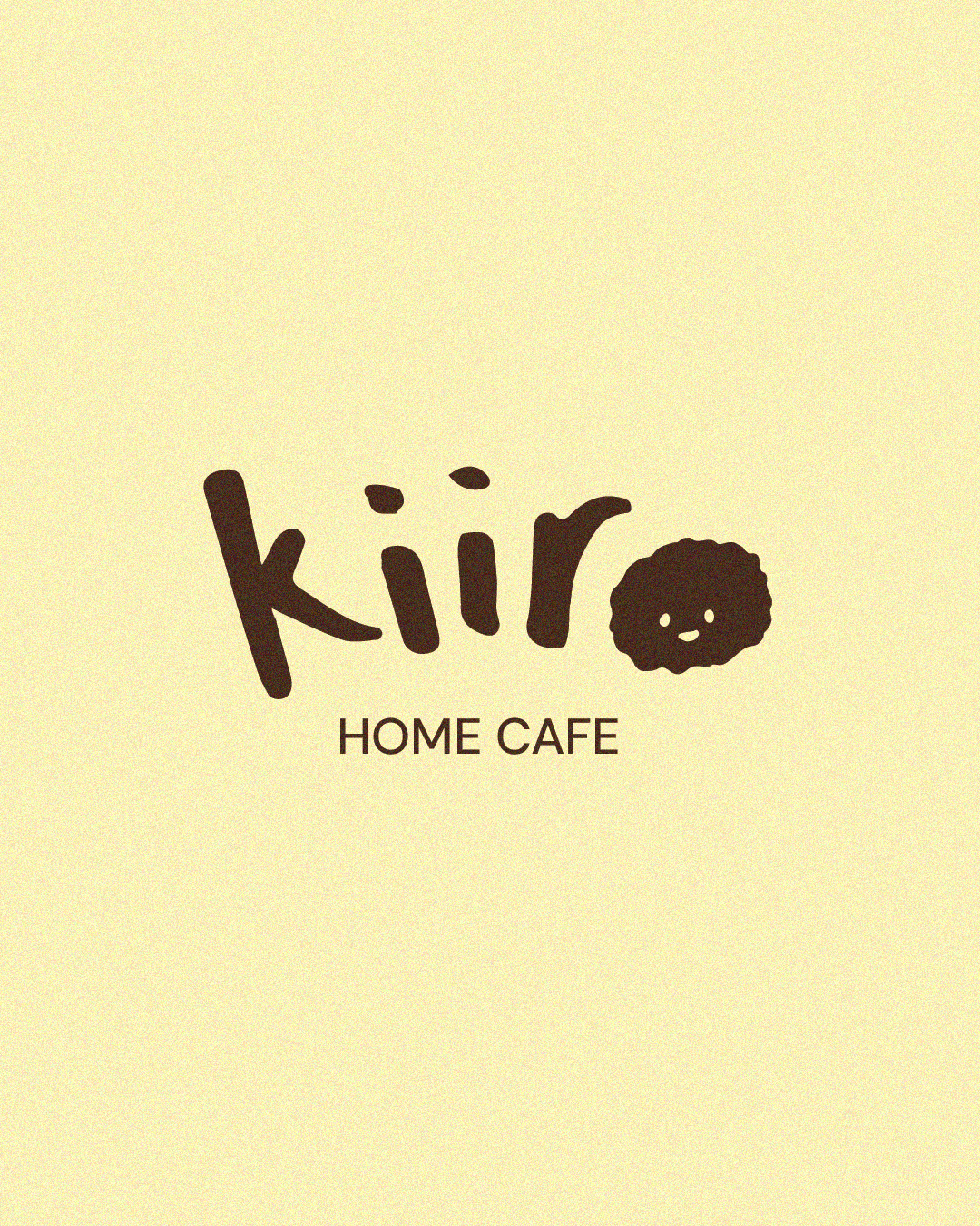
kiiro
A BRAND IDENTITY DESIGNED FOR KIIRO, A MICRO HOME BAKERY SPECIALISING IN UNDERRATED CAKES AND MATCHA. INSPIRED BY ITS NAME, WHICH MEANS YELLOW IN JAPANESE, THE BRAND CENTRES AROUND WARMTH, COMFORT, AND A HOMEMADE SENSIBILITY.
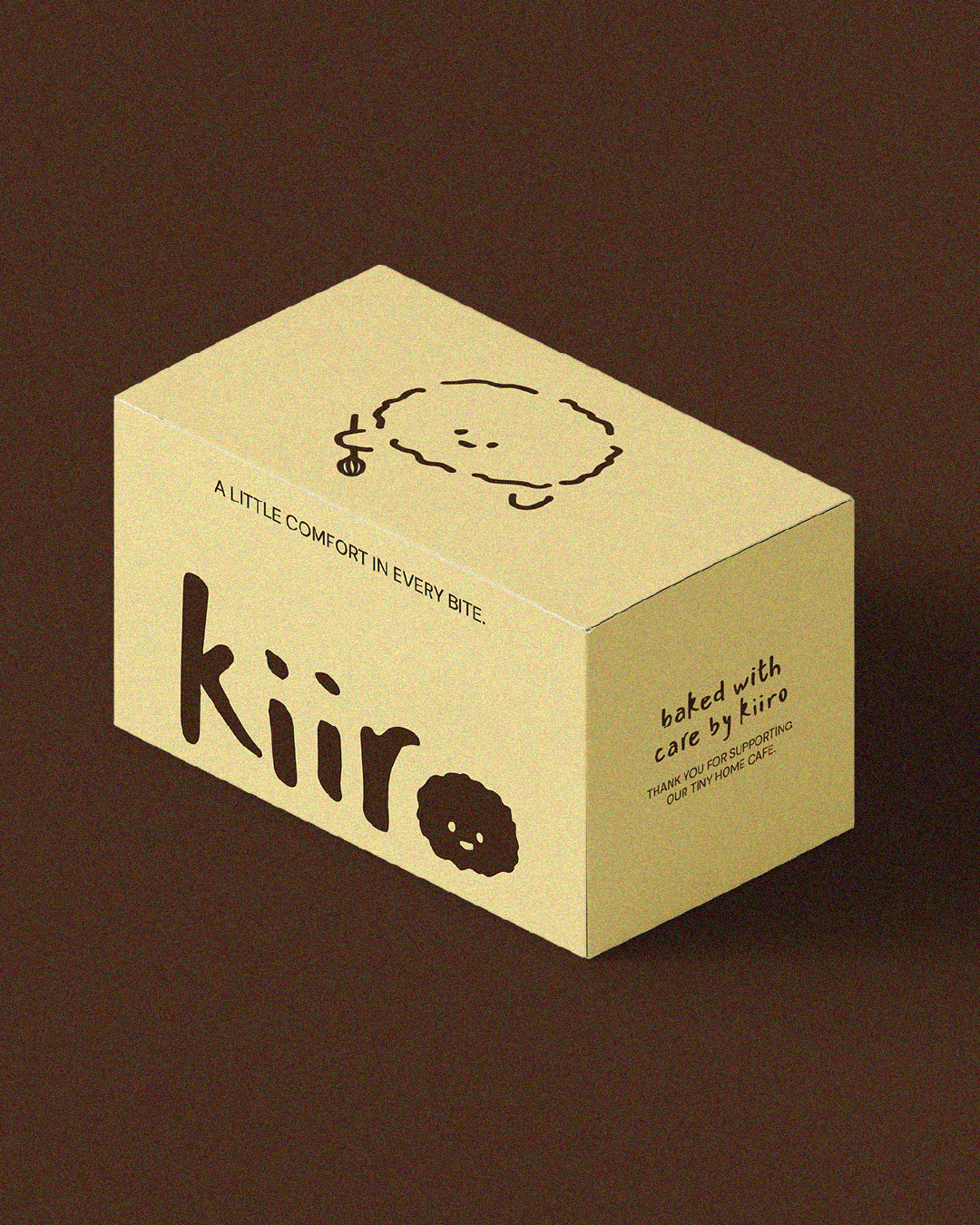
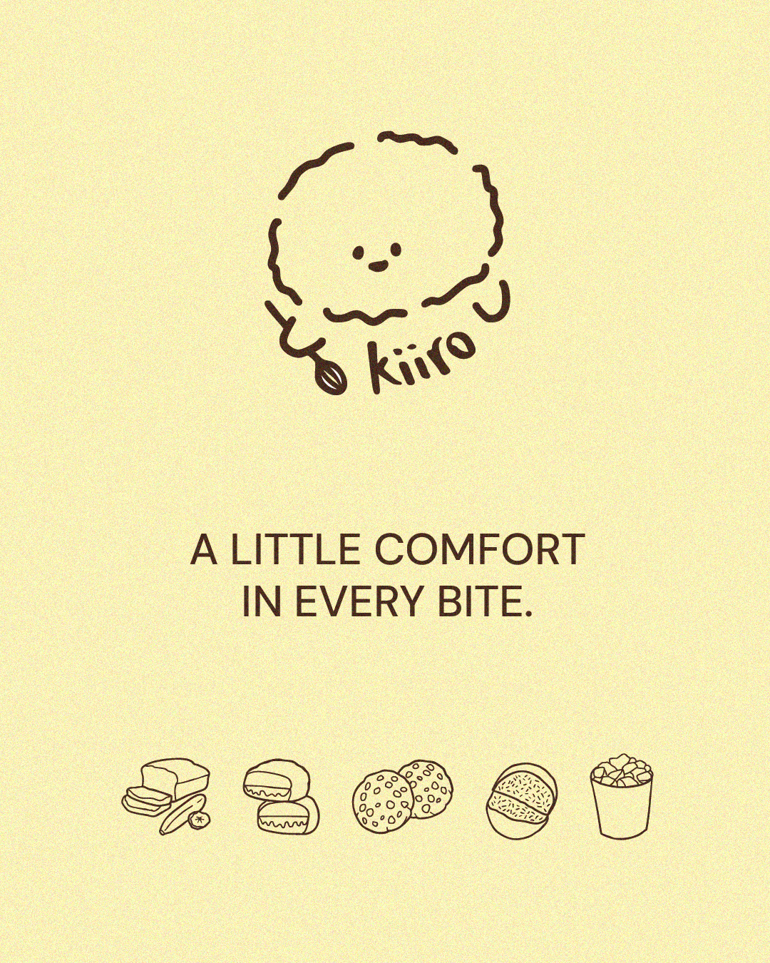
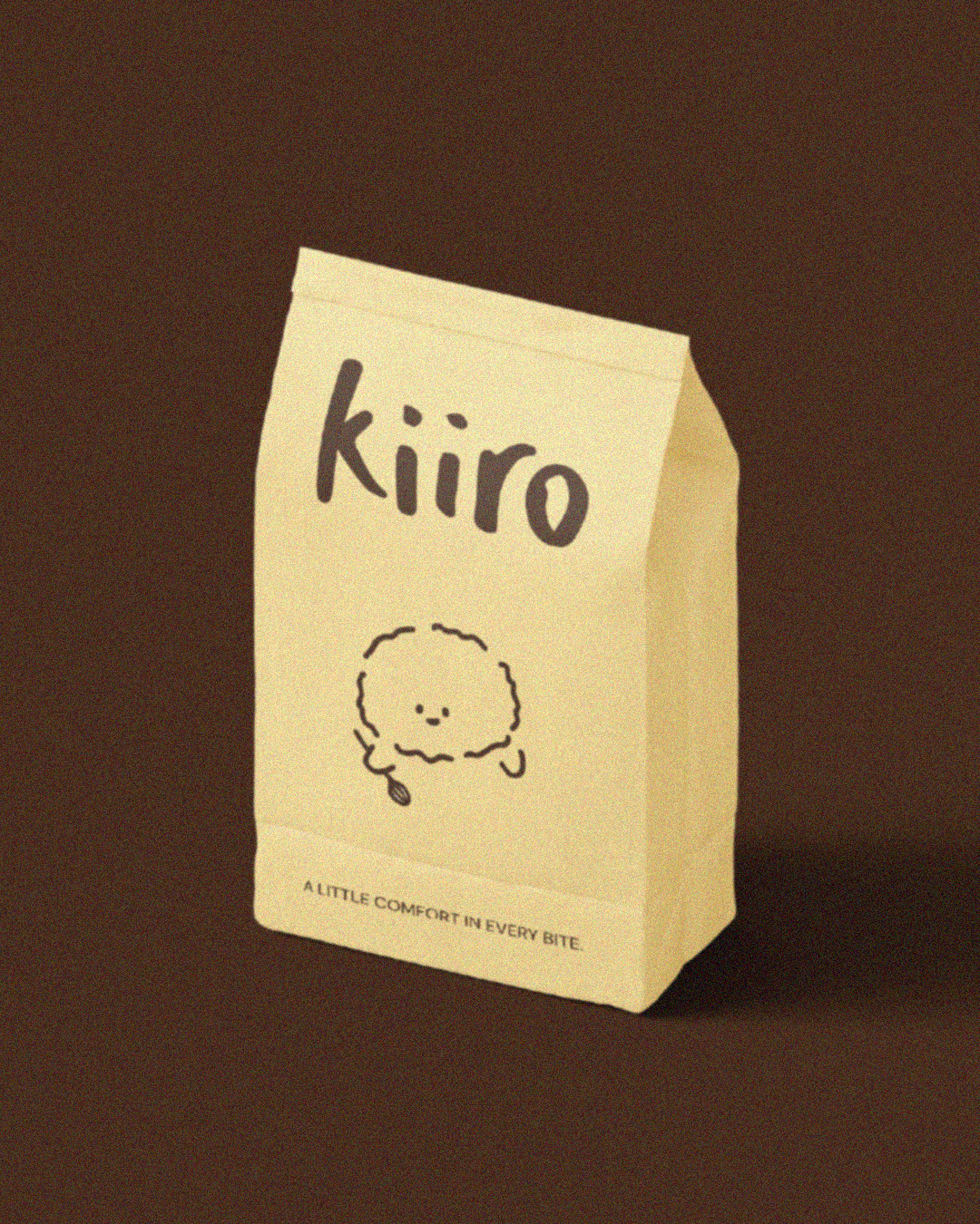
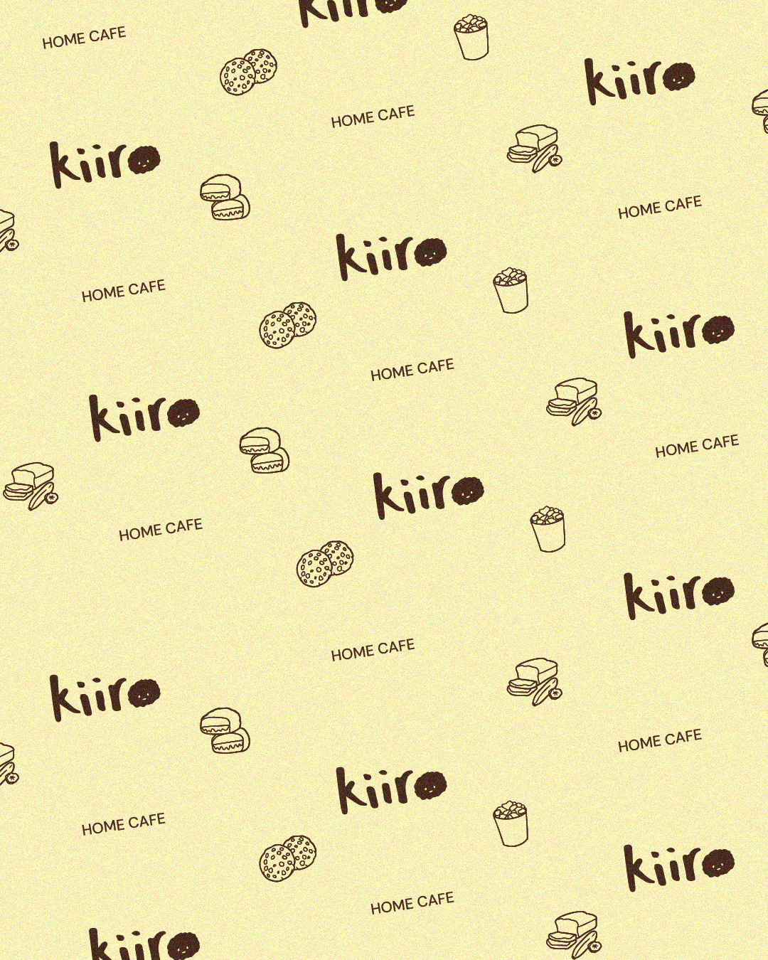
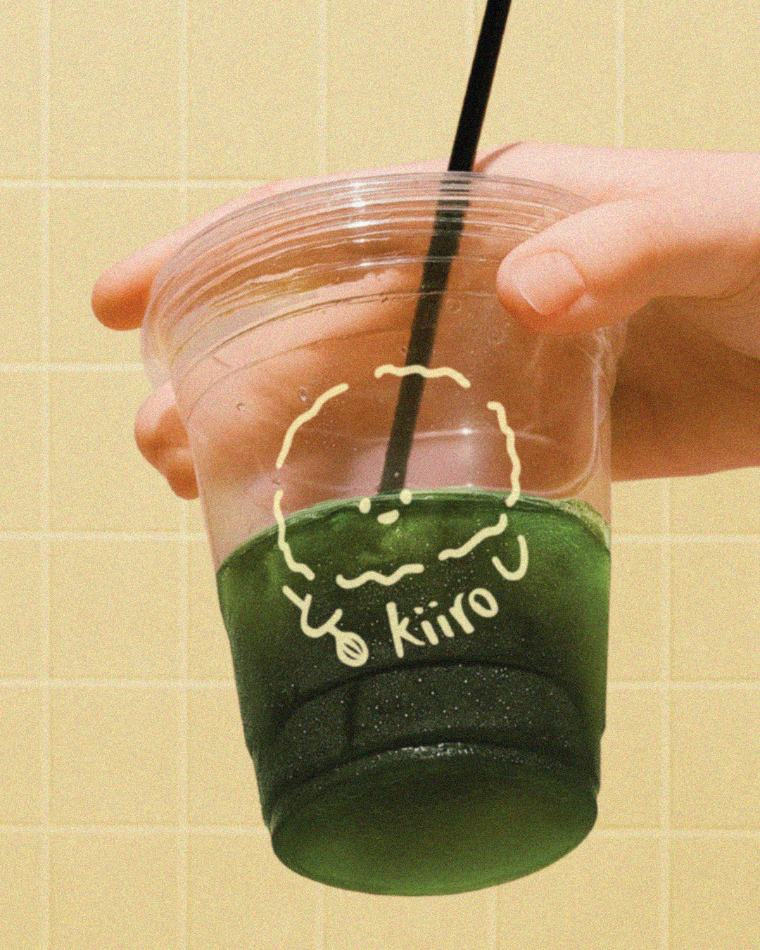
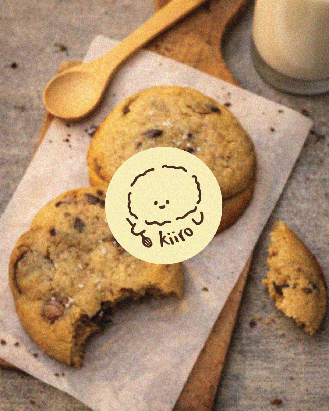
THE IDENTITY WAS DESIGNED TO FEEL FAMILIAR AND APPROACHABLE, WITH A SIMPLE HAND-DRAWN LOGO AND CUTE ILLUSTRATIONS THAT REFLECT THE BAKERY’S PERSONAL AND CRAFTED NATURE. THE VISUAL LANGUAGE LEANS INTO IMPERFECTION AND SOFTNESS, CREATING A COZY AND INVITING BRAND EXPERIENCE.
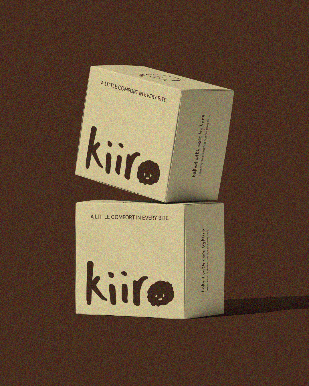
ONE OF THE LOGO VARIATIONS FEATURES A PLAYFUL CHARACTER IN PLACE OF THE LETTER “O,” DESIGNED TO RESEMBLE A FLUFFY CAKE. THE RESULT IS A BRAND IDENTITY THAT FEELS COMFORTING, ADDICTIVE, AND FULL OF QUIET CHARM.